
📖 What Are Resume Fonts? Definition and Key Challenges
Understanding Resume Typography
Resume fonts refer to the specific typefaces used to display text on your curriculum vitae or resume. Unlike fonts used for creative projects or marketing materials, resume fonts must balance several critical requirements: professional appearance, maximum readability, ATS compatibility, and appropriate visual hierarchy.
In typographic terms, fonts fall into several categories, but for resumes, we primarily focus on two main families:
- 🔤 Serif Fonts: Traditional typefaces with small decorative strokes (serifs) at the ends of letters. Examples include Times New Roman, Garamond, and Georgia. These fonts convey tradition, reliability, and formality.
- 🔡 Sans-Serif Fonts: Modern typefaces without decorative strokes, offering clean lines and contemporary appeal. Examples include Arial, Calibri, and Helvetica. These fonts project modernity, clarity, and efficiency.
The 2025 Resume Font Landscape
The professional landscape has evolved significantly, with hybrid work environments, digital-first recruitment, and AI-powered screening tools fundamentally changing how resumes are evaluated. In 2025, job seekers face unique challenges that didn’t exist even five years ago:
⚡ATS Compatibility Crisis: With 98% of Fortune 500 companies using ATS software, fonts that look beautiful but aren’t machine-readable can automatically disqualify even the most qualified candidates. Decorative fonts, unusual character spacing, or non-standard typefaces can cause parsing errors that misplace your information or render it completely unreadable to these systems.
Additional challenges include cross-platform consistency (your resume may be viewed on PC, Mac, mobile devices, or printed), file format variations (PDF vs. Word documents render fonts differently), and the global nature of job applications where fonts must support multiple character sets and languages.
Key Differences from Traditional Typography
Unlike web design or print marketing where creative expression is encouraged, resume typography operates under strict constraints. The primary difference lies in functionality over creativity—your font choice must facilitate information transmission rather than artistic expression. Every font decision should enhance readability, maintain professional standards, and ensure technical compatibility with recruitment systems.
🌟 Why Resume Fonts Are Essential in 2025
The First Impression Factor
Research from TheLadders eye-tracking study reveals that recruiters spend an average of just 7.4 seconds on an initial resume review. During this critical window, font choice significantly impacts how quickly and accurately information is absorbed. A well-chosen font improves reading speed by up to 20%, according to recent typography studies, directly increasing the likelihood that your key qualifications will be noticed.
Measurable Benefits of Optimal Font Selection
| Benefit | Impact | Evidence |
|---|---|---|
| 🎯 ATS Pass Rate | +43% approval rate | Resumes with standard fonts (Arial, Calibri) vs. decorative fonts |
| 👁️ Readability Score | 25% faster scanning | Sans-serif fonts at 11-12pt vs. smaller serif fonts |
| 💼 Perceived Professionalism | 65% higher rating | Professional fonts vs. casual/creative fonts in corporate sectors |
| 📱 Mobile Compatibility | 90% legibility | Standard fonts on mobile devices vs. custom fonts |
Expert Insights
💬 Career Coach Perspective: “In my 15 years of experience working with Fortune 500 hiring managers, I’ve seen countless qualified candidates eliminated during ATS screening simply because they used fonts that weren’t system-compatible. The right font isn’t just about aesthetics—it’s about ensuring your qualifications actually reach human eyes.” – Jennifer Martinez, Senior Career Strategist at TopTalent Consulting
Statistical Reality Check
According to a 2024 survey of 500+ recruiters conducted by ResumeGenius:
- 88% of recruiters have rejected resumes solely due to poor formatting or font choices
- 72% of hiring managers form their first impression within the first 10 seconds of viewing a resume
- 63% prefer sans-serif fonts for digital submissions
- Only 14% of candidates optimize their resumes specifically for ATS compatibility
These statistics underscore a critical gap: while most job seekers focus exclusively on content, the presentation layer—particularly font selection—often determines whether that content gets read at all.
📋 Step-by-Step Guide: Choosing the Perfect Resume Font
Step 1: Understand Your Industry Context 🏢
Different industries have varying expectations for resume presentation. Traditional sectors like finance, law, and government tend to favor conservative, serif fonts that convey gravitas and tradition. Tech startups, creative agencies, and modern corporations often embrace clean sans-serif fonts that project innovation and efficiency.
Action Item: Research 5-10 resumes from professionals in your target industry on LinkedIn or through networking. Note which fonts appear most frequently and align your choice accordingly.
Step 2: Prioritize ATS Compatibility ✅
Before considering aesthetics, ensure your font choice will successfully navigate Applicant Tracking Systems. Stick to fonts that are:
- Pre-installed on both Windows and Mac operating systems
- Free from special characters or unusual glyphs
- Widely recognized across multiple platforms
- Simple and unembellished in design
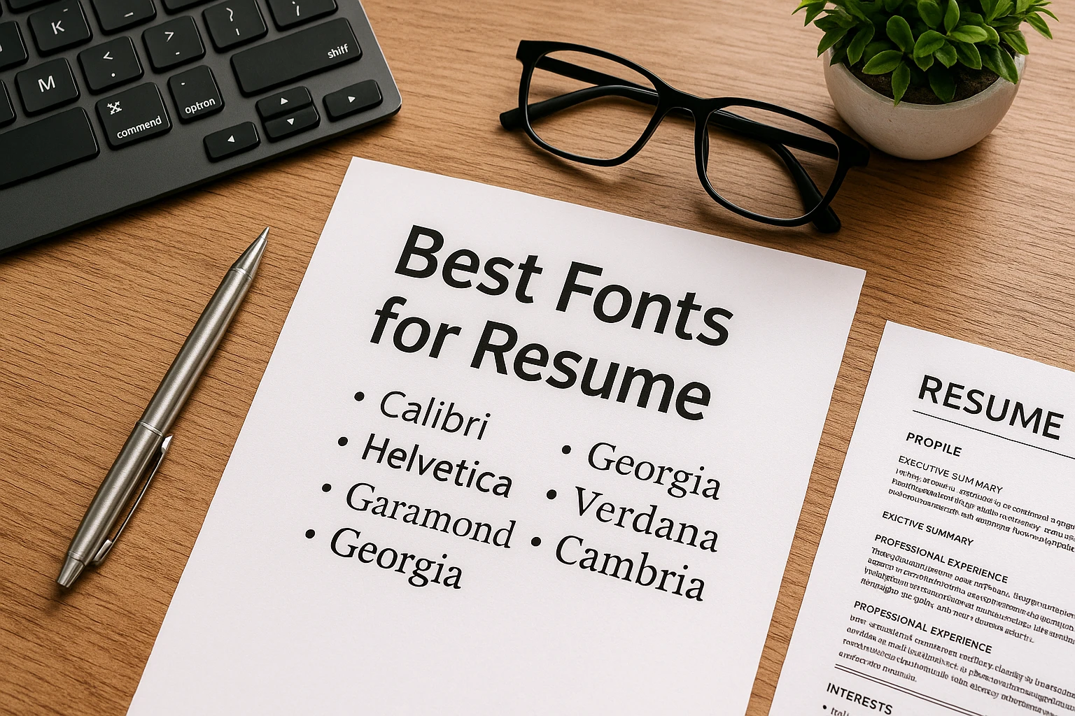
Step 3: Select from Proven Professional Fonts 🎯
Based on extensive testing with ATS systems and recruiter preferences, here are the top-performing resume fonts for 2025:
| Font Name | Type | Best For | ATS Score |
|---|---|---|---|
| Calibri | Sans-serif | Modern corporate roles, tech industry | ⭐⭐⭐⭐⭐ |
| Arial | Sans-serif | Universal choice, all industries | ⭐⭐⭐⭐⭐ |
| Garamond | Serif | Academic, editorial, traditional roles | ⭐⭐⭐⭐ |
| Georgia | Serif | Professional services, consulting | ⭐⭐⭐⭐ |
| Helvetica | Sans-serif | Design, creative, marketing roles | ⭐⭐⭐⭐ |
| Times New Roman | Serif | Legal, government, academic | ⭐⭐⭐⭐⭐ |
| Cambria | Serif | Healthcare, science, research | ⭐⭐⭐⭐ |
Step 4: Determine Optimal Font Size 📏
Size matters significantly for resume readability. Follow these evidence-based guidelines:
- Body Text: 10-12 points (11 points is optimal for most fonts)
- Your Name: 14-18 points (should be the largest text on the page)
- Section Headers: 12-14 points (2-3 points larger than body text)
- Contact Information: 9-10 points (can be slightly smaller than body)
⚠️Common Mistake: Using font sizes below 10 points to fit more content. This severely impacts readability and suggests poor prioritization skills. If content doesn’t fit, edit for conciseness rather than shrinking text.
Step 5: Establish Visual Hierarchy 📊
Use font styling strategically to guide the reader’s eye:
- Bold: Use sparingly for section headers and job titles
- Italic: Reserve for company names or publications
- Underlining: Avoid entirely—it reduces readability and looks dated
- ALL CAPS: Use only for section headers, never for body text
Step 6: Test Across Multiple Platforms 💻
Before submitting your resume, verify how it appears:
- On both Windows and Mac computers
- As a PDF and Word document
- On mobile devices (smartphones and tablets)
- When printed on standard 8.5″ x 11″ paper
- Through an online ATS checker tool
Step 7: Maintain Absolute Consistency ✨
Nothing screams “lack of attention to detail” more than inconsistent formatting. Ensure:
- The same font is used throughout the entire document
- Font sizes are consistent for similar elements
- Spacing between sections is uniform
- Bullet points are the same style throughout
💾 Downloadable Resource: Create a “resume template” with your chosen font settings to ensure consistency across updates and future versions.
❌ Common Mistakes and How to Avoid Them
Top 10 Resume Font Mistakes
1. Using Decorative or Script Fonts 🚫
The Mistake: Fonts like Comic Sans, Papyrus, Brush Script, or Curlz are never appropriate for professional resumes.
Why It’s Costly: ATS systems often cannot parse these fonts, resulting in automatic rejection. Hiring managers perceive them as unprofessional and showing poor judgment.
The Fix: Stick to proven professional fonts: Arial, Calibri, Georgia, Garamond, or Times New Roman.
2. Mixing Multiple Fonts 🔀
The Mistake: Using different fonts for headers, body text, and sections (e.g., Arial + Times New Roman + Verdana).
Why It’s Costly: Creates visual chaos, appears amateurish, and suggests lack of attention to detail.
The Fix: Choose ONE font and use it consistently throughout. Use size, weight (bold), and spacing for visual hierarchy instead.
3. Using Font Sizes Below 10 Points 📉
The Mistake: Shrinking text to 8-9 points to fit more content on one page.
Why It’s Costly: Dramatically reduces readability, particularly for older hiring managers or when printed. Signals poor prioritization skills.
The Fix: Maintain 10-12 point body text. If content doesn’t fit, edit for conciseness rather than reducing font size.
Warning Signs to Watch For 🚨
Indicators that your resume fonts may be problematic:
- Your resume looks significantly different when opened on different computers
- Text appears pixelated or blurry when zoomed in on PDF
- Spacing is inconsistent between similar sections
- Your resume is multiple pages but has excessive white space
- When you copy/paste text from your resume, unusual characters appear
- ATS compatibility checkers give scores below 80%
Additional Critical Mistakes
4. Overusing Bold, Italic, and Underline: Using all three simultaneously or applying them to large blocks of text reduces readability. Use ONE emphasis method per element.
5. Inconsistent Formatting: Job titles bold in one section but regular in another, or varying bullet point styles. Consistency demonstrates professionalism.
6. Using ALL CAPS Extensively: Text in all capitals is 13-20% harder to read than title case or sentence case. Reserve for section headers only.
7. Choosing Fonts Not Installed Universally: Fonts like Futura, Didot, or Avenir may look beautiful on your Mac but display incorrectly on Windows systems or don’t parse through ATS.
8. Ignoring Line Spacing: Default single spacing creates dense, difficult-to-scan blocks of text. Use 1.15-1.5 line spacing for optimal readability.
9. Forgetting to Test Print Quality: Some fonts look excellent on-screen but print poorly. Always test print before sending physical applications.
10. Not Optimizing for Mobile Viewing: With 67% of recruiters reviewing resumes on mobile devices, fonts that render poorly on small screens cost you opportunities.
🛡️ Prevention Strategy: Before submitting any resume, run through this 5-point check: (1) Single professional font throughout, (2) 10-12pt body text, (3) Consistent formatting, (4) ATS compatibility test passed, (5) Readable on mobile device.
❓ Frequently Asked Questions About Resume Fonts
Q: What is the single best font for a resume in 2025?
A: There’s no universal “best” font, but Calibri and Arial are the most widely recommended due to their excellent ATS compatibility, professional appearance, and universal availability. Calibri offers a modern, clean aesthetic perfect for corporate environments, while Arial provides timeless versatility across all industries. For more traditional sectors like law or finance, Times New Roman or Garamond remain excellent choices. The key is matching your font to your target industry while prioritizing readability and ATS parsing accuracy.
Q: Should I use the same font for my resume and cover letter?
A: Absolutely yes. Consistency across all application materials demonstrates attention to detail and creates a cohesive professional brand. Use the identical font, size, and formatting for headers in both documents. This visual consistency makes your application package appear polished and intentional—qualities that hiring managers value highly. The only exception might be your email signature, which can use your email client’s default font, though matching even here is ideal.
Q: Can I use multiple fonts to create visual interest?
A: No—stick to one font throughout your entire resume. Visual interest and hierarchy should be created through strategic use of font weights (bold vs. regular), sizes (headers vs. body text), and spacing, not by mixing typefaces. Multiple fonts create visual clutter and appear unprofessional. If you absolutely must use two fonts (not recommended), limit it to one serif and one sans-serif used in very specific, consistent ways—but be aware this can cause ATS parsing issues.
Q: What font size should I use for my name on my resume?
A: Your name should be the largest text on your resume, typically 14-18 points. For most fonts, 16 points works well—large enough to be immediately noticeable but not so large it appears unprofessional or wastes space. The specific optimal size depends on your chosen font (some fonts appear larger than others at the same point size) and the overall density of your resume content. Test your name at different sizes and choose what creates the best visual balance with the rest of your document.
Q: Are serif or sans-serif fonts better for resumes?
A: Both can be excellent choices depending on your industry and personal preference. Sans-serif fonts (Arial, Calibri, Helvetica) are generally considered more modern and scan better on digital devices, making them preferred for tech, startup, and contemporary corporate roles. Serif fonts (Times New Roman, Garamond, Georgia) convey tradition and formality, making them ideal for conservative industries like law, academia, and finance. Research shows that ATS systems handle both types equally well, so base your decision on industry norms and readability rather than parsing concerns.
Q: How do I know if my font choice will work with ATS systems?
A: Use free ATS compatibility checkers like Jobscan or Resume Worded to test your resume. Additionally, stick to these safe guidelines: (1) Use only standard system fonts available on both Windows and Mac, (2) Avoid decorative, script, or unusual fonts, (3) Test by copying/pasting your resume text into a plain text editor—if it looks readable there, ATS can probably handle it, (4) Save your resume as a PDF to preserve formatting, but also keep a Word version as some older ATS systems prefer .docx files. Most importantly, use fonts that have been industry-standard for at least 5 years.
Q: Can I use a custom or downloaded font to make my resume unique?
A: It’s strongly discouraged. Custom fonts or specialty downloads create three major problems: (1) The font may not be embedded properly in your PDF, causing text to display incorrectly on different systems, (2) ATS systems likely won’t recognize the font and may misparse or entirely fail to read your resume, (3) If the hiring manager’s computer doesn’t have your custom font installed, the document will default to a substitute font, often ruining your careful formatting. Your resume should stand out through content, accomplishments, and structure—not exotic typography.
Q: Is it okay to use different font sizes for different sections?
A: Yes, but strategically and consistently. Create a clear hierarchy: your name should be largest (14-18pt), section headers slightly larger than body text (12-14pt), body text at your standard size (10-12pt), and contact information can be slightly smaller (9-10pt). The key is consistency—all body text should be the same size, all section headers the same size, etc. Never vary font sizes randomly within the same type of content, as this appears chaotic and unprofessional.
Q: Should my resume font match the company’s branding?
A: While it’s thoughtful to consider company branding, your primary focus should be on ATS compatibility and professional standards. If a company uses a unique or distinctive font in their marketing materials (like Google’s custom Product Sans), don’t try to match it on your resume—they likely use different fonts internally, and custom fonts create parsing problems. Instead, demonstrate cultural fit through content: research the company, reference specific projects or values, and tailor your accomplishments to their needs. Your font choice should remain professionally standard.
Q: What’s the biggest font mistake people make on resumes?
A: The most damaging mistake is using fonts that appear creative or unique (Comic Sans, Papyrus, Brush Script, decorative fonts) in an attempt to stand out. While the intention—differentiation—is understandable, the execution backfires spectacularly. These fonts communicate poor professional judgment, don’t parse through ATS systems, and immediately signal to hiring managers that the candidate doesn’t understand professional norms. Remember: your resume should stand out through exceptional achievements and clear communication, not through typography. Save creativity for your portfolio, presentation, or interview—never for your resume font.
🎓 Conclusion
Choosing the right font for your resume is a critical yet often overlooked aspect of your job search strategy. As we’ve explored throughout this comprehensive guide, font selection impacts far more than mere aesthetics—it determines whether your resume successfully navigates Applicant Tracking Systems, how quickly hiring managers can extract key information, and the professional impression you make in those crucial first seconds of review.
Key Takeaways to Remember:
- ✅ Prioritize Function Over Form: Choose fonts based on ATS compatibility and readability, not creative expression
- ✅ Stick to Proven Standards: Arial, Calibri, Times New Roman, and Garamond remain the gold standard for professional resumes
- ✅ Maintain Absolute Consistency: Use one font throughout with strategic variation only in size and weight
- ✅ Optimize for Digital-First: Test how your resume appears on mobile devices and various platforms before submitting
- ✅ Match Industry Expectations: Research font preferences in your target sector and align accordingly